

About the project:
This project is a study of Overwatch 2. It is the outcome of the ELVTR UX/UI for gaming course, aiming to demonstrate the methods and process of UX/UI design in a gaming context. The case study also highlights the process of optimizing the Mode Selection Screen UI mockup.
Role:
UX/UI Designer
Project Length:
8 weeks
Tools:
Figma. Photoshop
Challenges:
Limited knowledge of FPS game and the game rules of Overwatch 2.
Limited access to the 3D art resources.
Limited access to the 3D art resources.
Create a smooth mode selection experience for all the players.

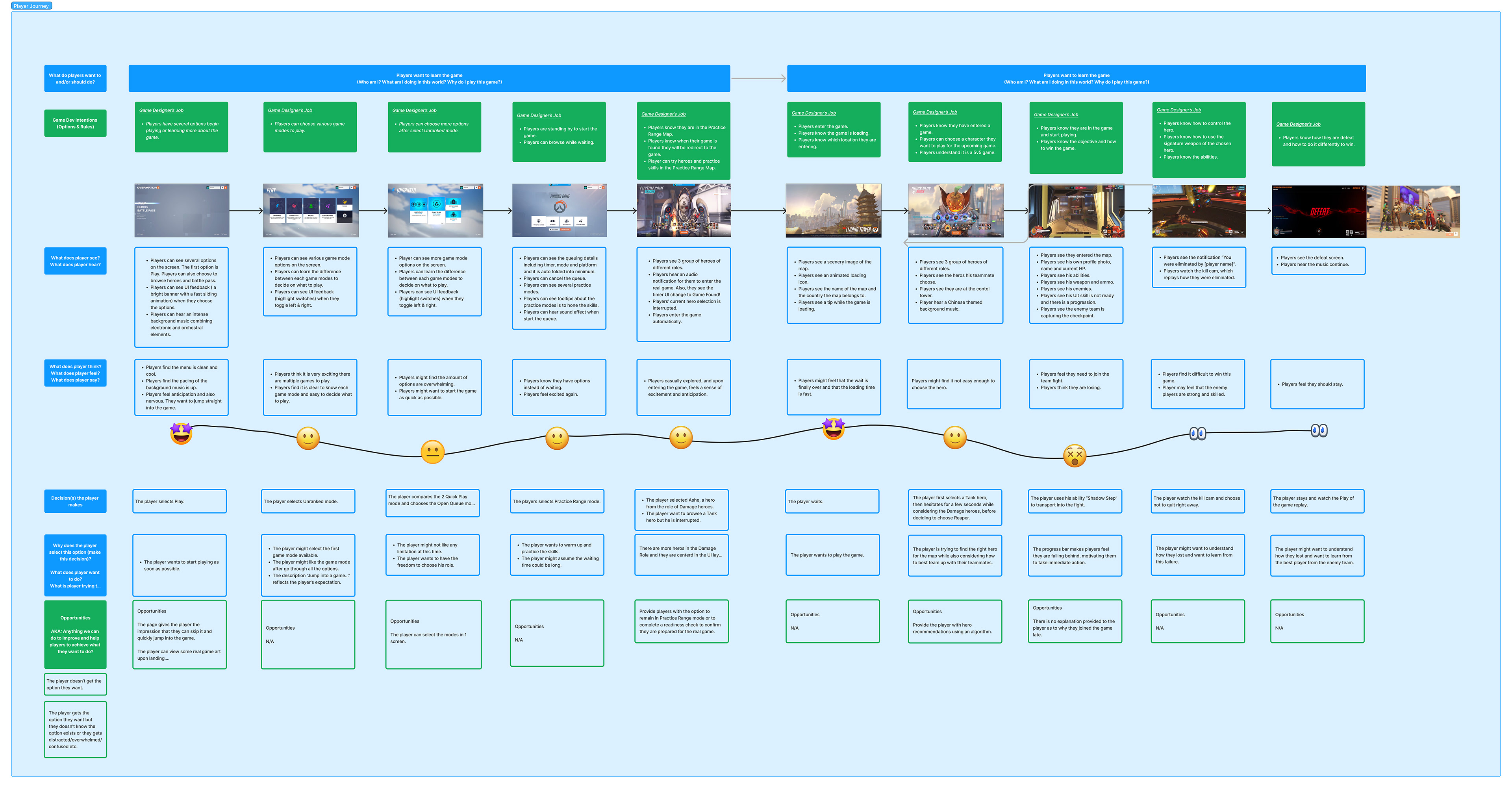
Player Journey:
Figma Prototype & Flow Chart:
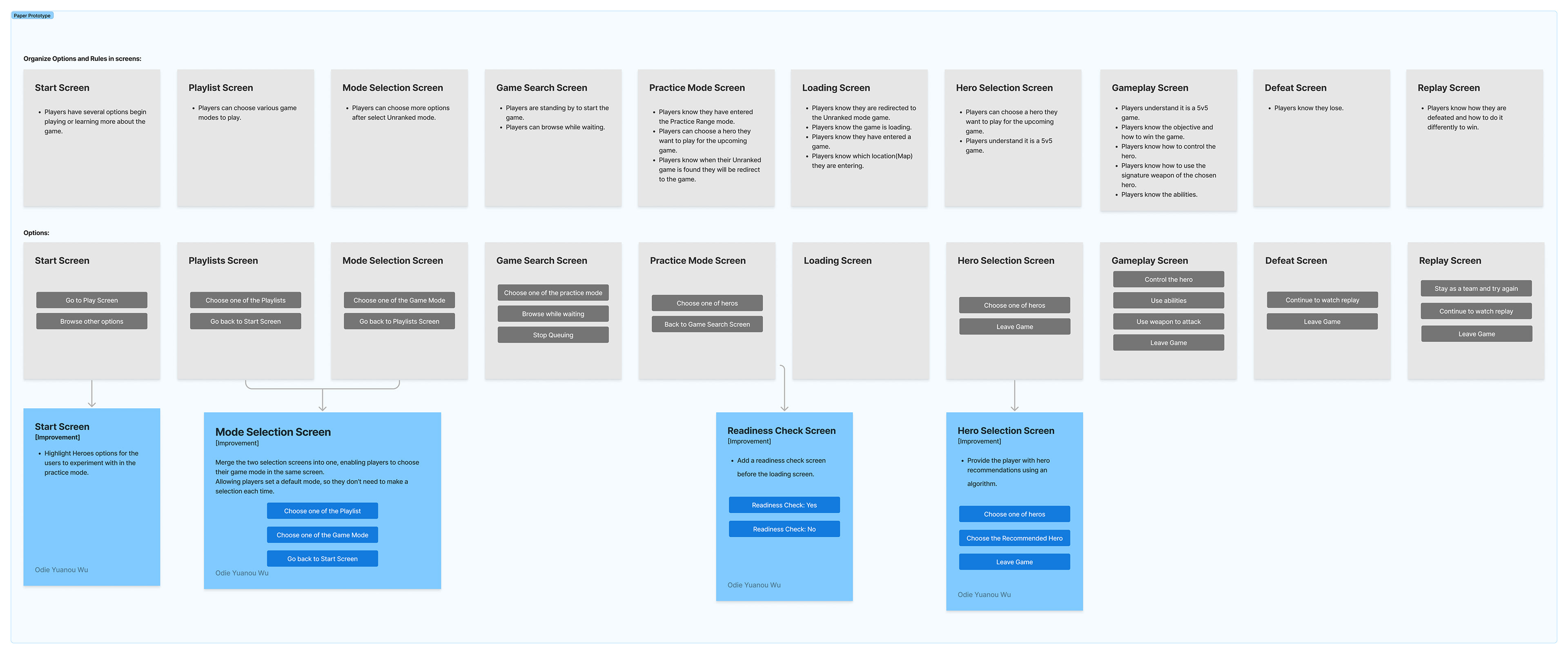
Prototype in Figma

Flow Chart
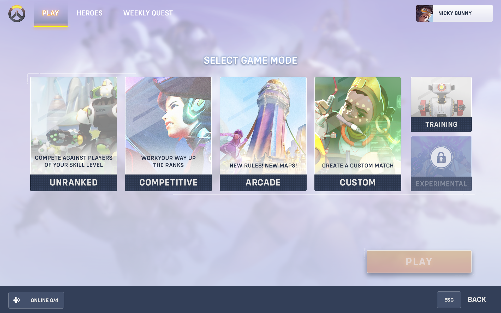
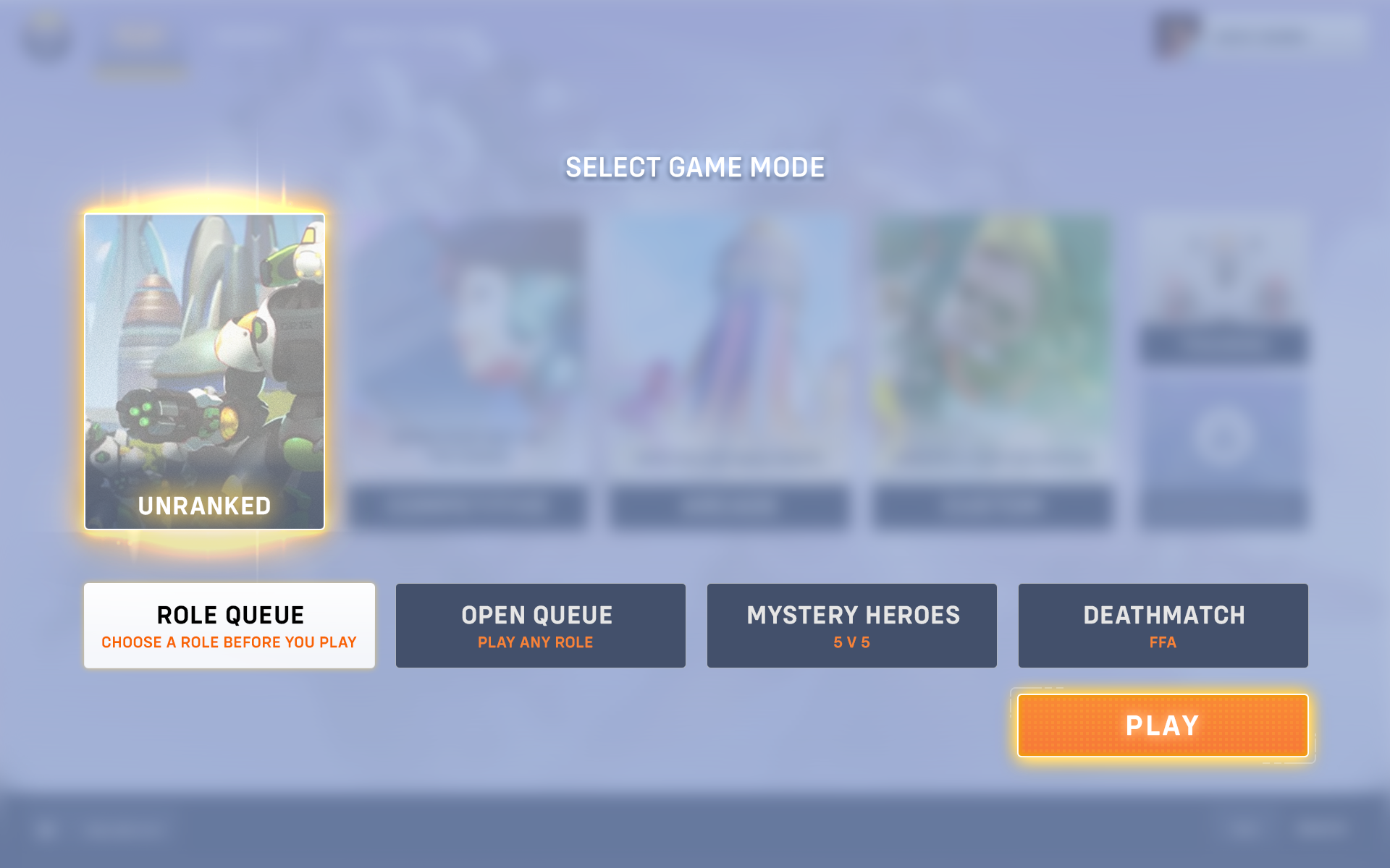
Wireframe & iterations:
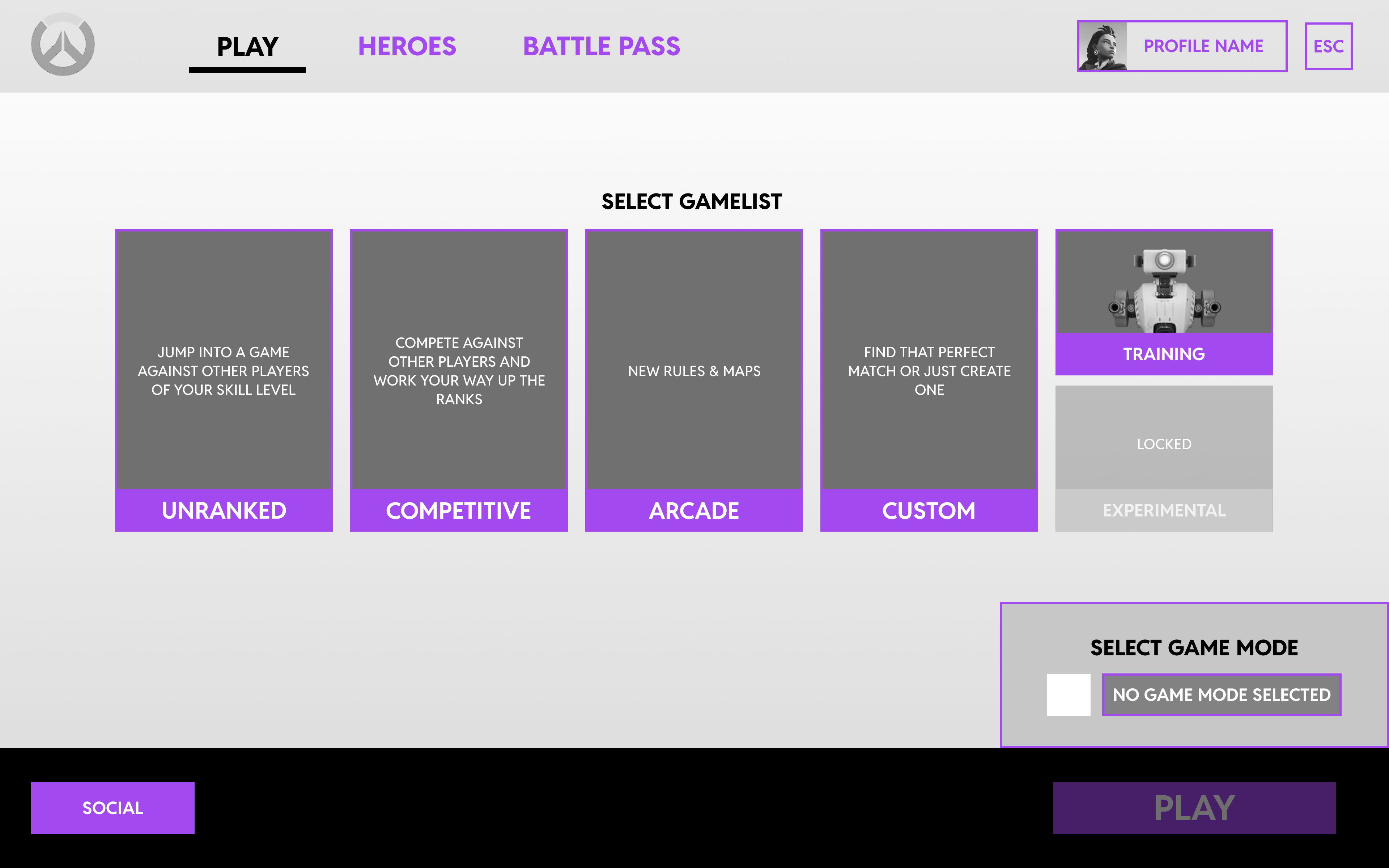
Home Screen - Playlist Selection
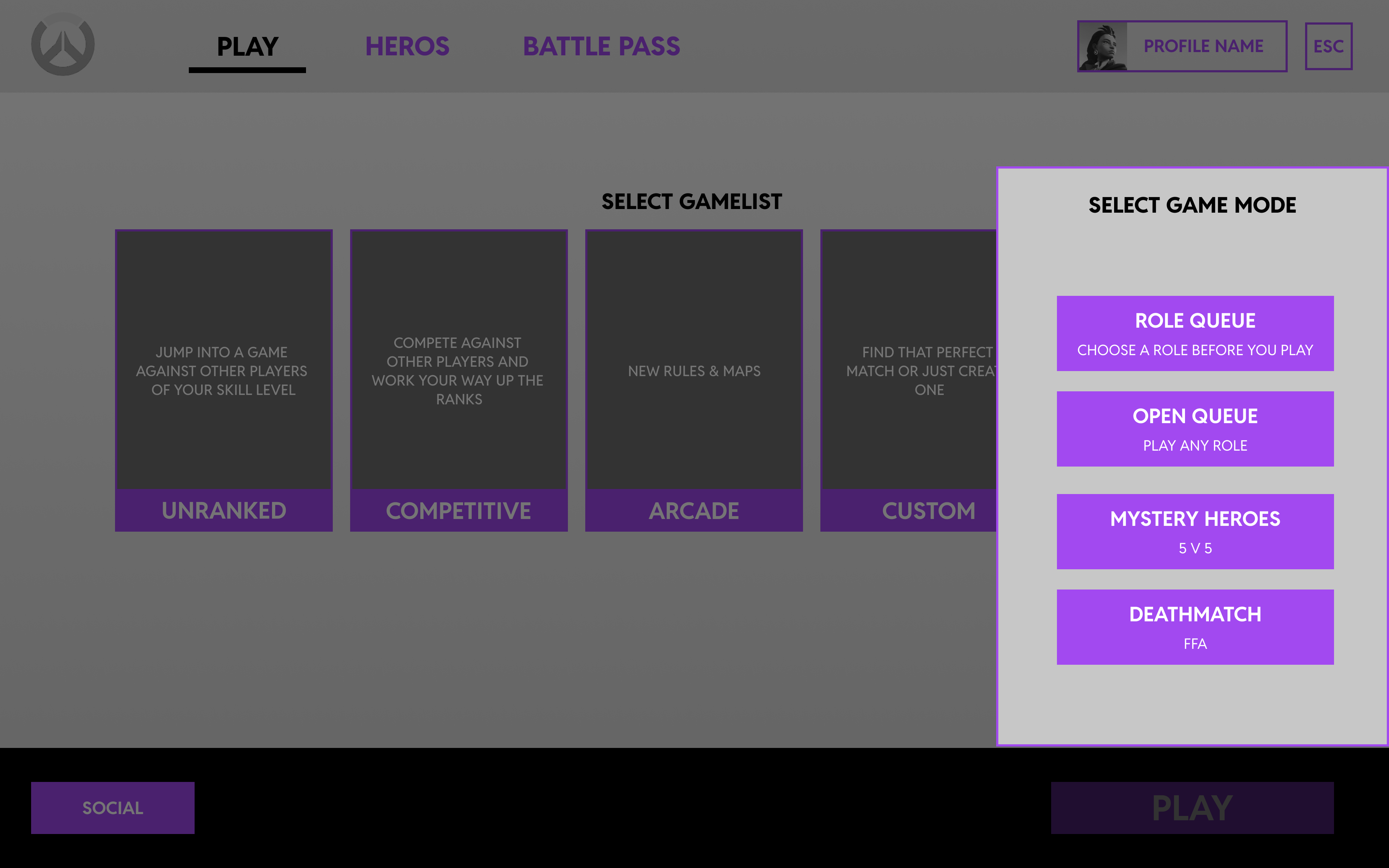
Home Screen - Mode Selection
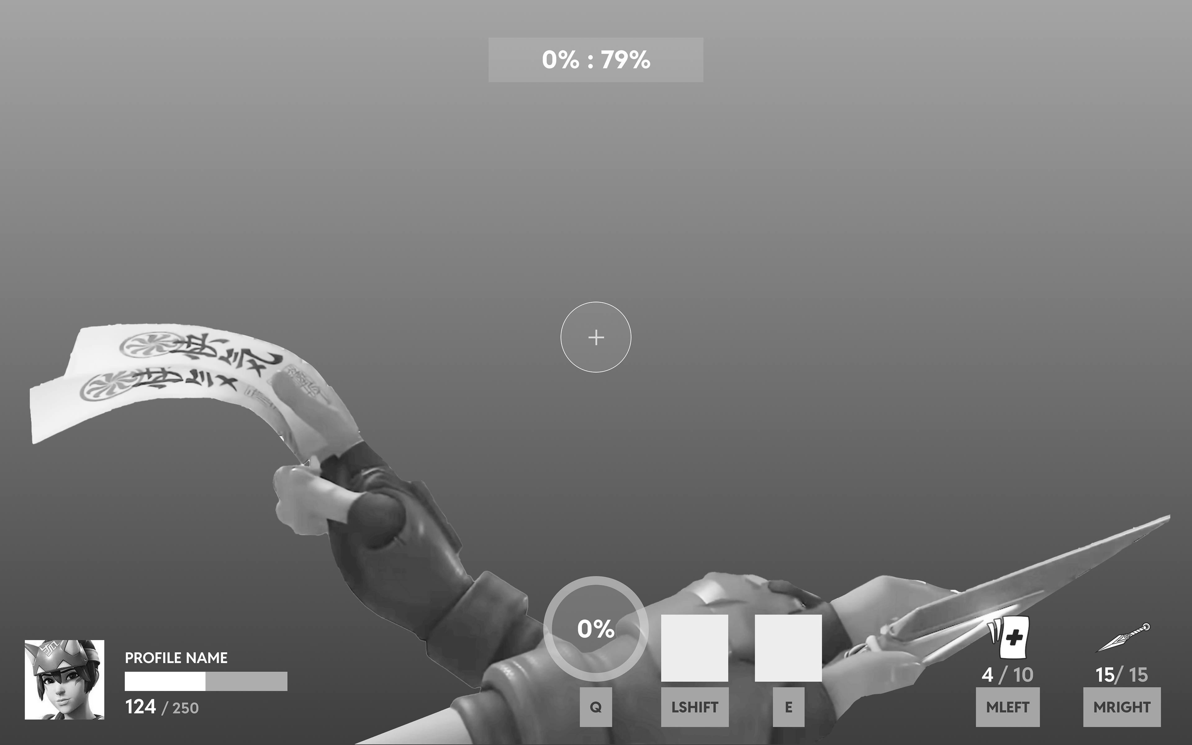
Gameplay Screen
Usability Test Session Notes:
1. There are so many options, so players might feel a bit confused when see the screen the first time.
Make the game list and game mode selection into two steps, presented sequentially within the same page, without the need to navigate to a second screen.
2. The training robot icon is too prominent, which distracts players from making a choice.
During the UI art phase, ensure that the visual weight of all icons is more balanced to avoid influencing player decisions.
3. The Game Mode is set to an unselected state by default, which might make players think it is not interactive.
Design the selector to appear interactive by adding visual cues, such as a subtle highlight, hover effects, or changing the default placeholder text to an action like "Select a mode" to indicate that it can be interacted with.
4. The “Social” button is confusing.
Transform it into a friend list button to make its purpose clearer.
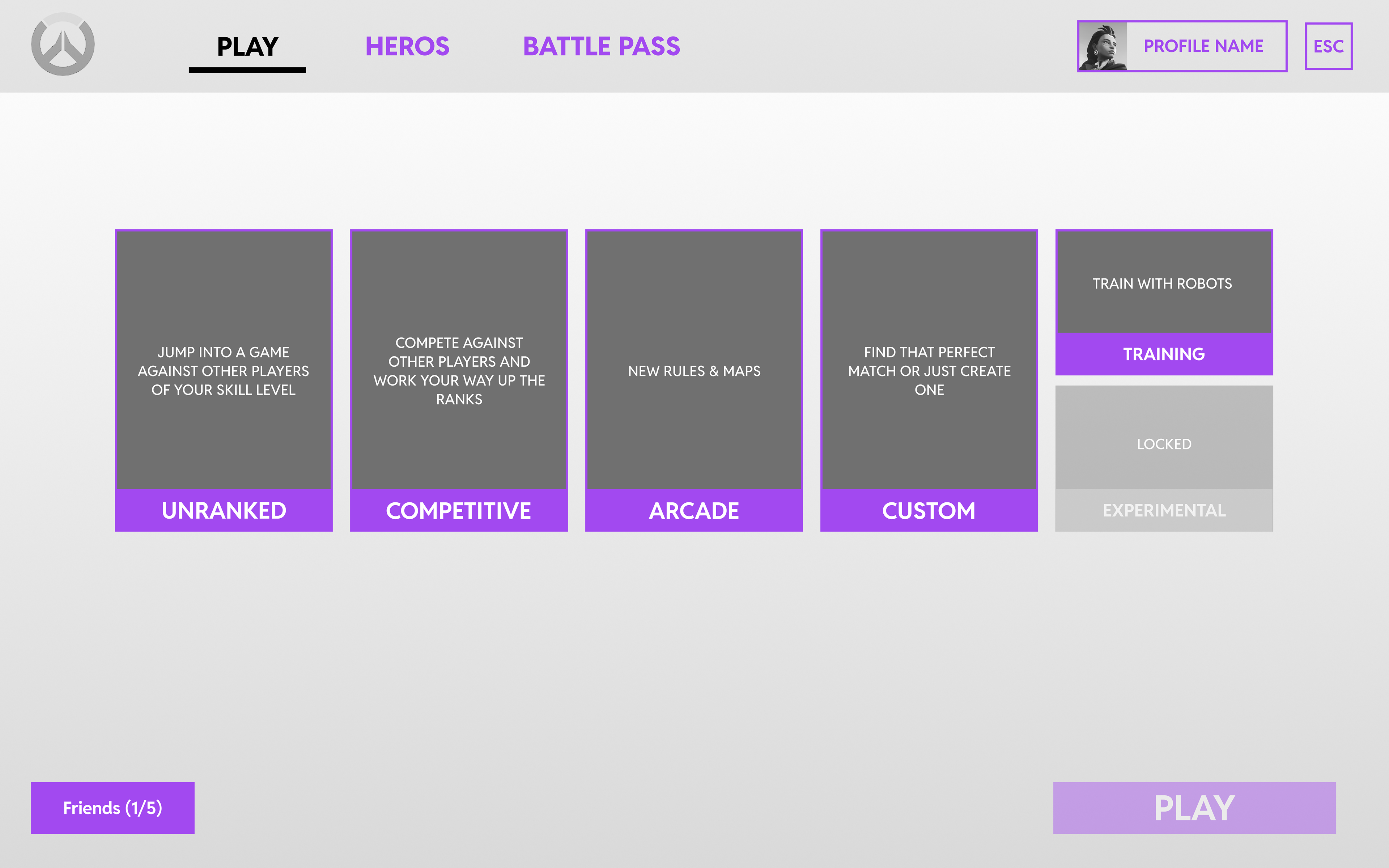
Home Screen - Gamelist Selection
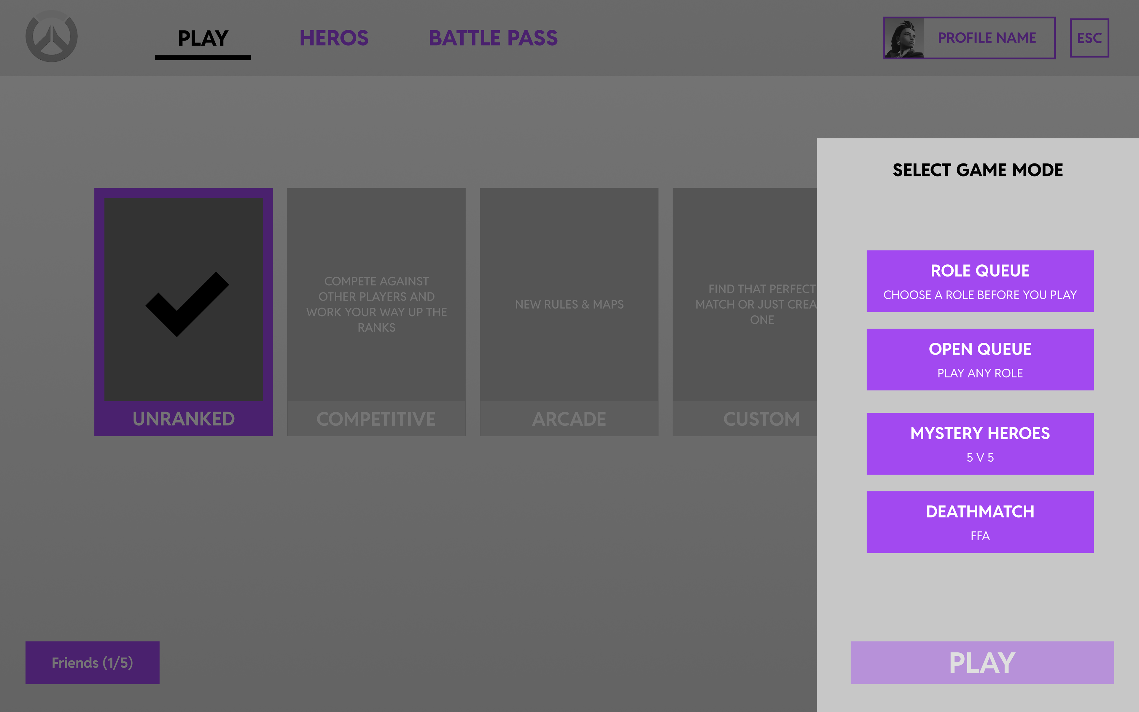
Home Screen - Mode Selection
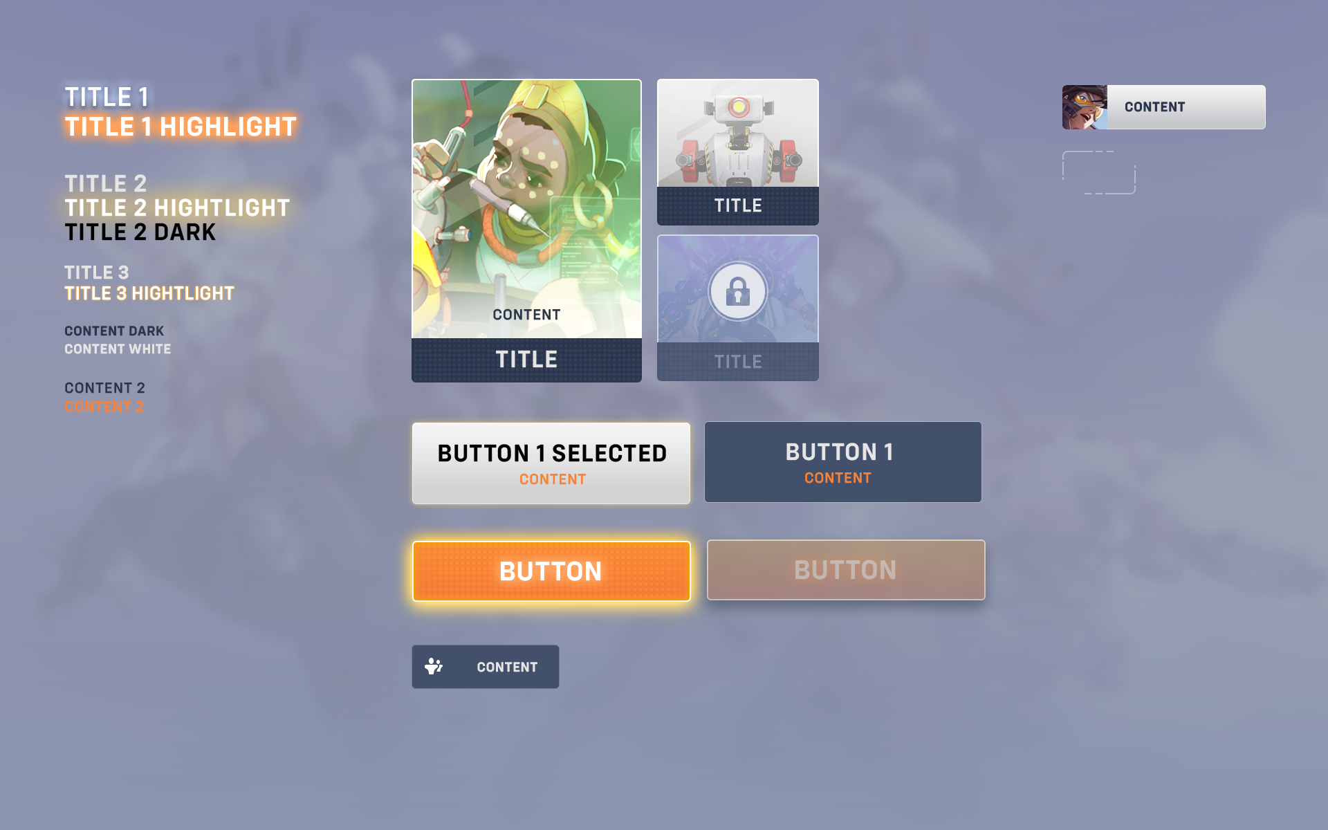
UI Mockups
Outcome:
To design the experience from the players' perspective, I analyze a player's gameplay video. To understand the player's full experience throughout the game, I created a user journey. It helps me to bridge the game designer's intentions and the players's reactions. Identifying issues players encounter, I redesign the flow with new flowcharts and wireframes. Usability testing helps reveal issues before finalizing UI mockups. Lastly, I conduct a colour blindness accessibility test to ensure proper contrast and colour choices.